Technique 1
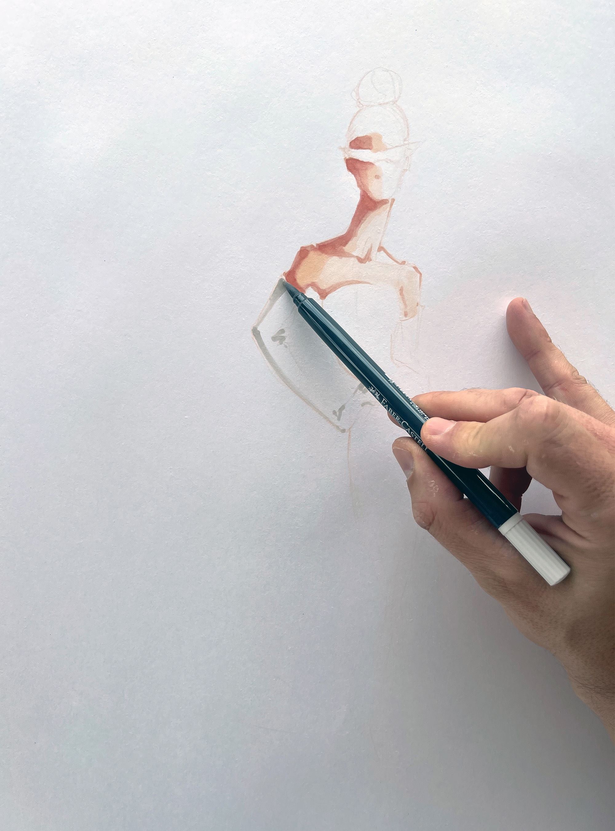
I first started applying the skin tone using the 281 Sand marker with the brush tip. Adding shadows and some color accents with 382 Dull Beige and 303 Powder markers. I also enjoyed making an outline of the silhouette with the fine tip. Something normally not found on alcohol based markers.
After having completed the skin section I used Warm grey 270 to create some shadows and depths on the white glove. I always enjoy using a light grey to render white fabric taking advantage of the possibility of applying several layers to add volume and depth.
After having completed the skin section I used Warm grey 270 to create some shadows and depths on the white glove. I always enjoy using a light grey to render white fabric taking advantage of the possibility of applying several layers to add volume and depth.

Having so many shades and intensities of the same color is just a dream. Creating depth by adding layers and going up on the scale. In this case of the scale of warm grays.
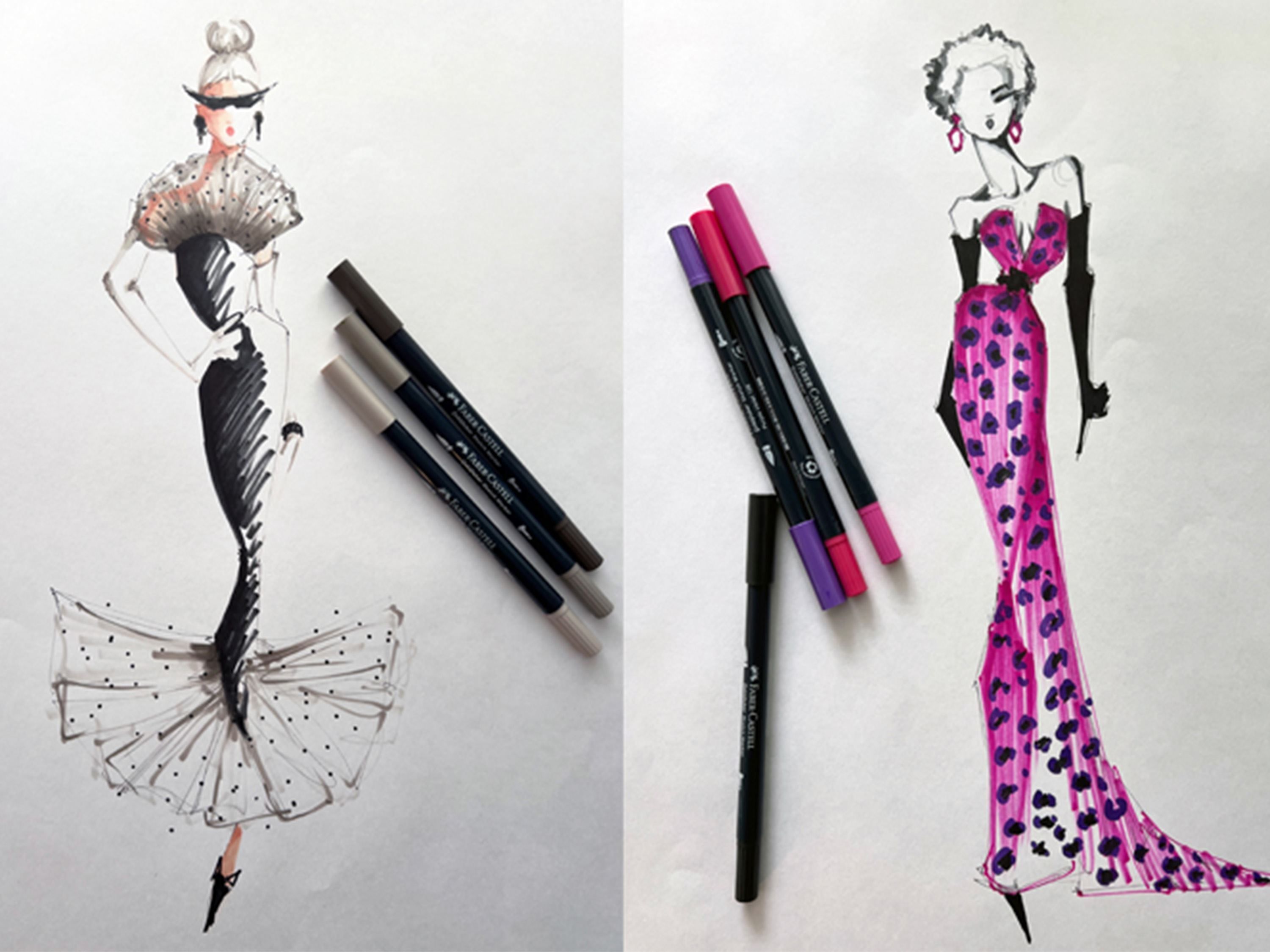
To represent lace and sheer fabrics I started with the 270 Warm Grey, the lightest shade to create an outline and cover the surface that then I slowly covered with Warm Grey 272, creating shadows and accents. Then adding Warm Grey 274 as a last layer to add even more depth to the fabric.
Using Warm Grey 274 and Black to create dots on the fabric and some additional details.
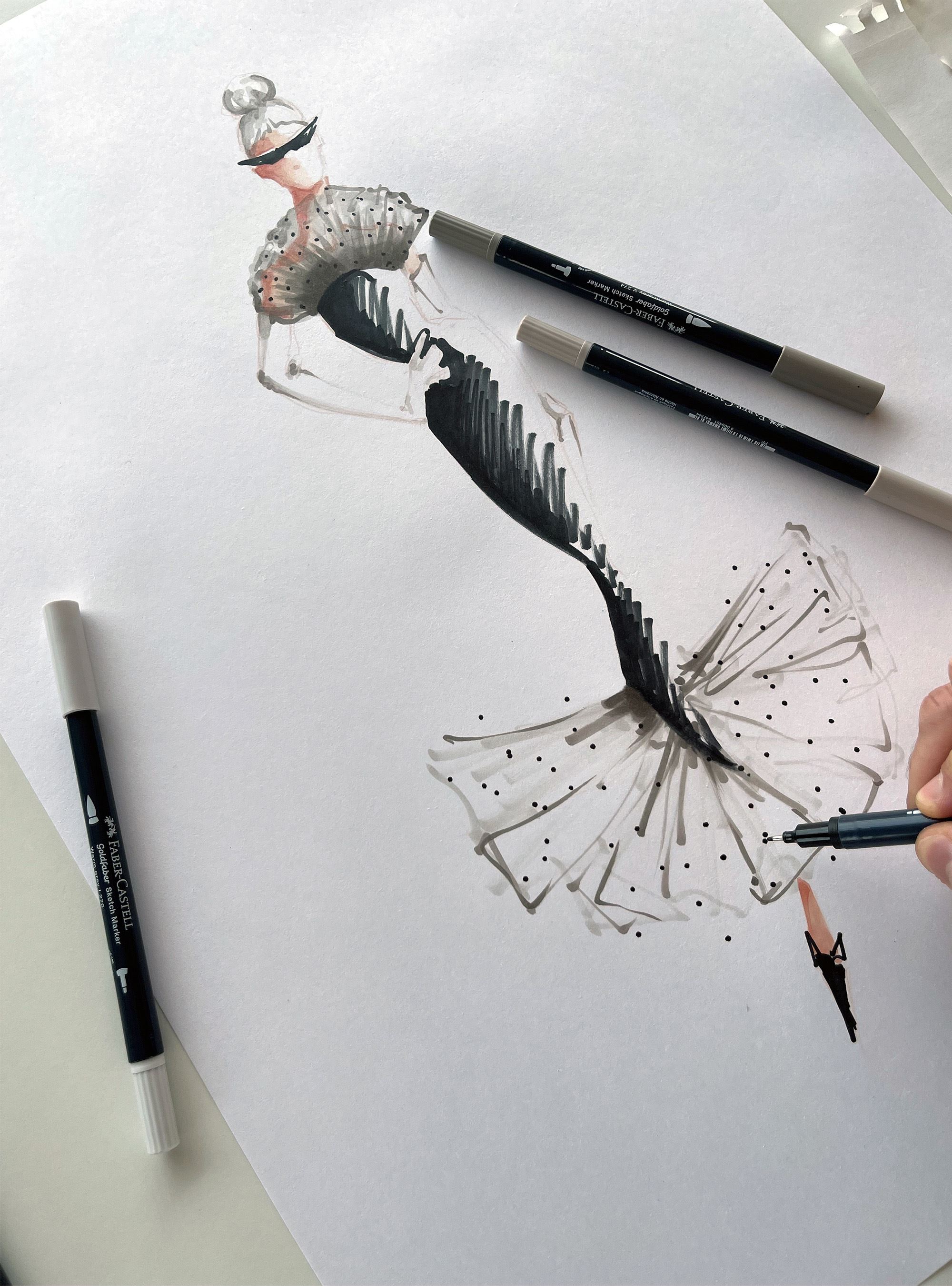
To render the silhouette of the dress and the fabric of the dress itself I used the black marker. First with the fine tip to outline the dress and then using the brush nib to fill out the space. Loved using it freely and letting slide on the paper creating traces and lines.

Technique 2

Creating Shading and depth when it comes to skin tones is one of my favorite things to do. The possibilities are endless once you have so many shades of the same color, in this case Neutral Grey, to just add layer upon layer until you achieve the final desired result.
I started with Neutral great 331 to create the outline and initial shape of the hair, face and torso, then covering as much surface as I needed to represent the female face. Then adding Neutral Grey 333 to start creating shadows and depths.
The part I love adding a darker shade to create the shapes are the side of the forehead, the eyelid, under the chin, shoulders and the base of the neck.
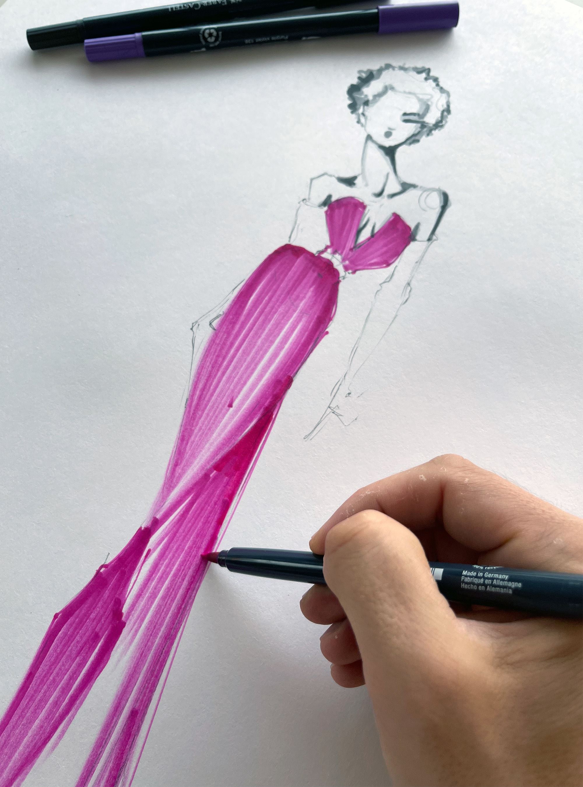
First I Used the fine tip of the 125 purple pink marker to sketch the outline of the gown and the area I would later fill in.
Using the brush tip of the 125 Middle Purple pink Marker to render the pink fabric of the gown.
Going all the way from the top of the dress until the train, making long, consistent and smooth lines.
Using the brush tip of the 125 Middle Purple pink Marker to render the pink fabric of the gown.
Going all the way from the top of the dress until the train, making long, consistent and smooth lines.
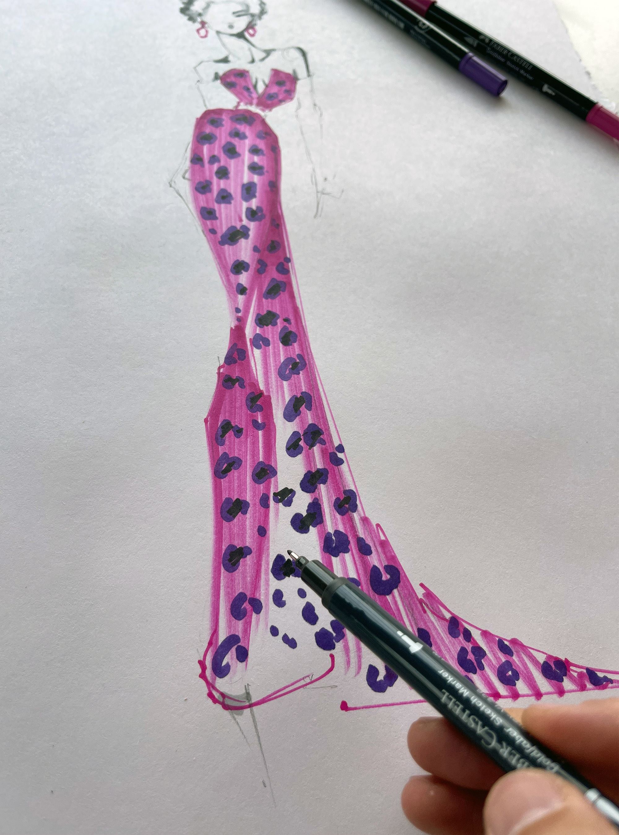
To create the effect of the animal print I used marker number 136 Purple Violet on top the previous 125 pink to create the shapes of the cheetah spots. Leaving a gap in the middle which then I filled with the Neutral Grey 336, one of the darkest shades on that color.
I found the pigment and density of the FABER CASTELL GoldFaber was so intense that using a darker shade of the marker covered the lighter previous color completely. Achieving the effect I wanted.
I found the pigment and density of the FABER CASTELL GoldFaber was so intense that using a darker shade of the marker covered the lighter previous color completely. Achieving the effect I wanted.

Technique 3
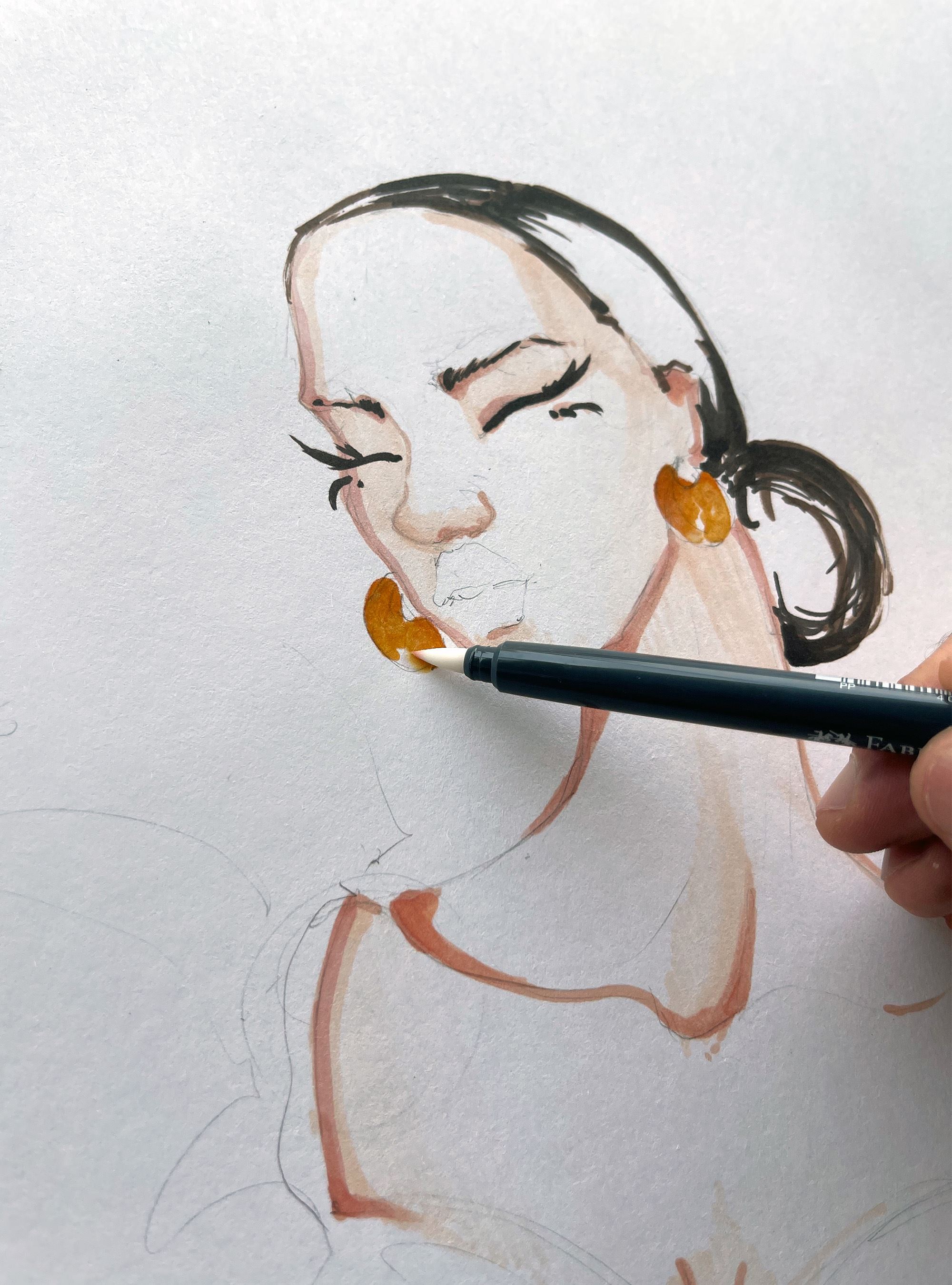
One of my favorite tools and favorite techniques would be using the Colorless Blender. When working with the FABER CASTELL Goldaber sketch alcohol based markers, I found fascinating how easy it was to blend the different tones of colors using the colorless blender.
In this case the 109 Dark Chrome Yellow and 111 Cadmium Orange to render metal and gold earrings. By applying both colors and creating and overlapping layer, and going over that area with the colorless blender, Once the blender dries the effect is seamless and perfectly blended.
In this case the 109 Dark Chrome Yellow and 111 Cadmium Orange to render metal and gold earrings. By applying both colors and creating and overlapping layer, and going over that area with the colorless blender, Once the blender dries the effect is seamless and perfectly blended.

Creating the print of the dress, I decided to represent a very summery mediterranean pattern by representing cherries. I thought it would be a great opportunity to indulge in the use of the colorless blender. Laying down a layer of the 126 permanent Carmine, and then addend a layer of the 127 pink carmine only on one side of the cherry to create a feeling of depth and volume.
Again, by going over the overlap area with the colorless blender and letting it dry it creates a wonderful effect so hard to get when using alcohol markers. In this case the intensity of the blender is just wonderful and the cherries came out looking more realistic than I had expected.
Again, by going over the overlap area with the colorless blender and letting it dry it creates a wonderful effect so hard to get when using alcohol markers. In this case the intensity of the blender is just wonderful and the cherries came out looking more realistic than I had expected.
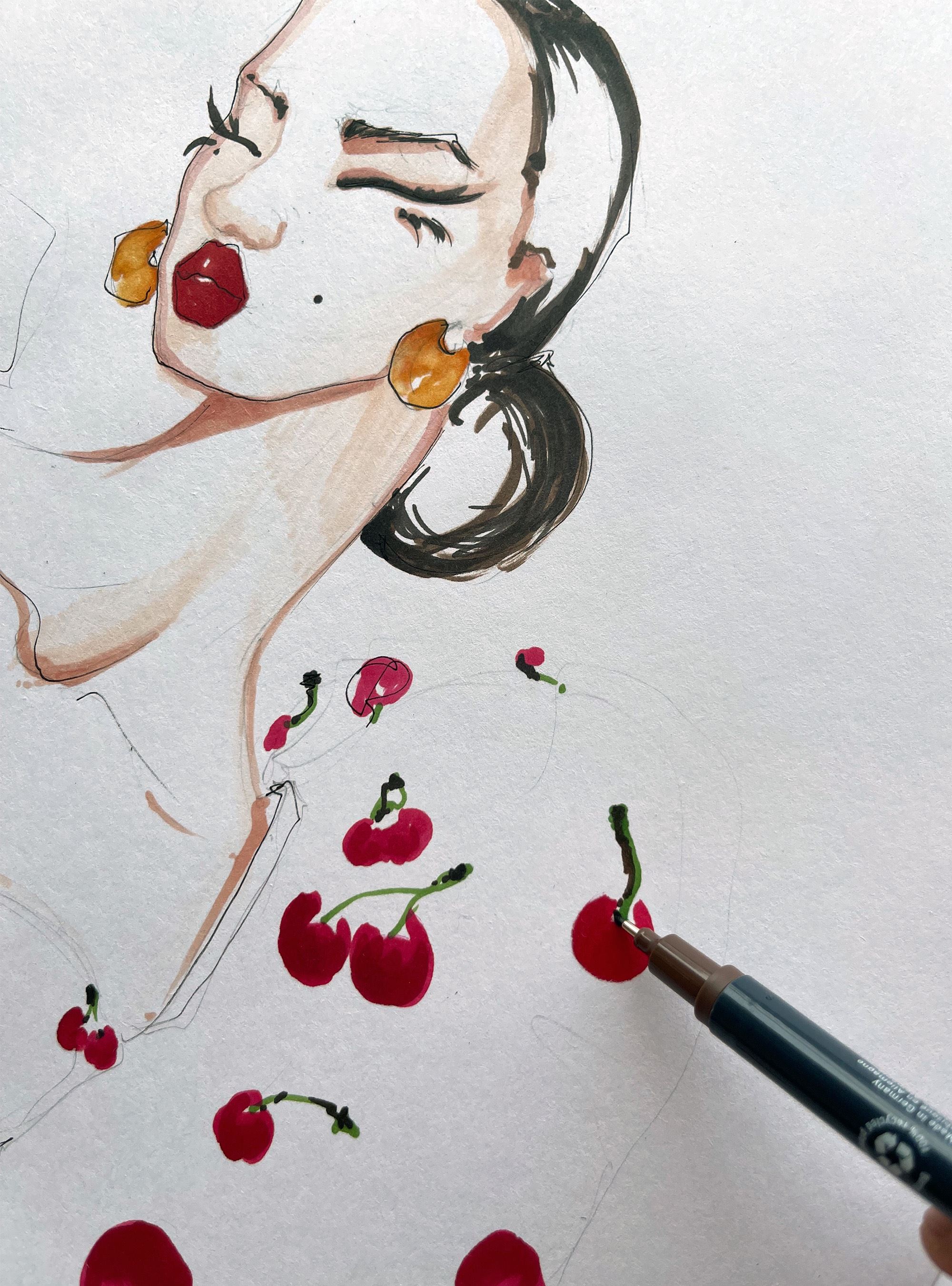
The final touchy to create the cherries was to add the stem. I used the 112 Green leaf fine tip marker to create the shape of the stem and then adding some shading using 280 Burnt Amber and 175 Dark Sepia. Again using as a final step the colorless blender so both colors would blend as much as possible once dried.
